
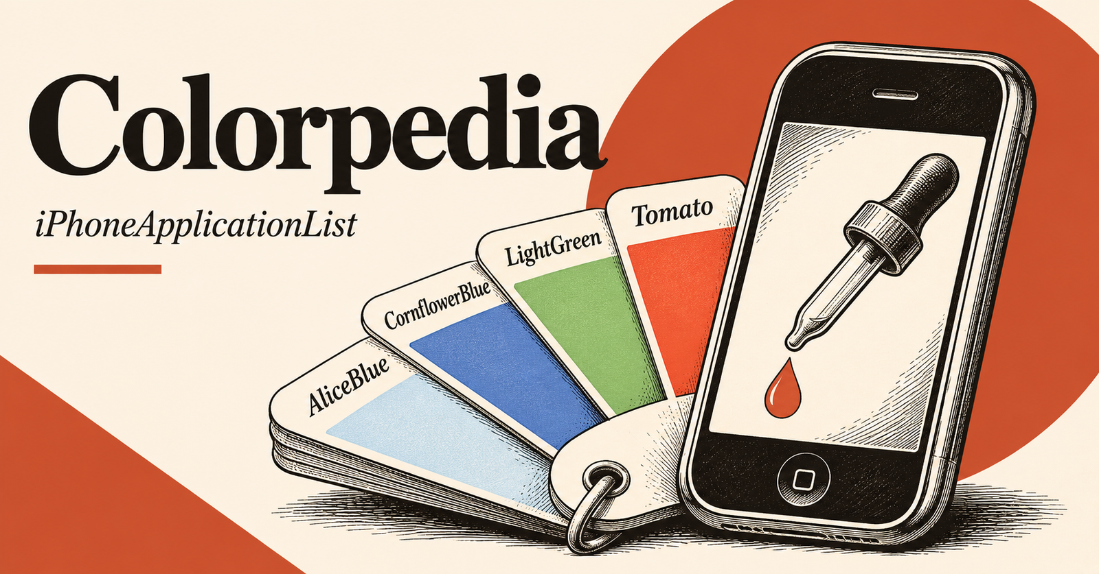
Colorpedia was a casual color-reference tool by Pixagora. The January 2009 description emphasized public-domain color names and a card-deck presentation inspired by Hideaki Chijiiwa’s Color Harmony.
A visual starting point for a palette
The historical app was presented as a way to explore color combinations without relying on names from professional color catalogs. Its card metaphor suggests browsing and comparing alternatives, rather than treating a list of names as a production specification.
The source does not establish that Colorpedia offered calibrated measurement, print matching or a particular export format. A color shown on a phone should therefore not be treated as a verified physical swatch from this description alone.
Move from inspiration to a usable specification
For a digital project, assign colors roles such as background, text and emphasis, then record the exact values used in the actual design file. Test the combination at the size and brightness where it will be read. A palette that looks attractive as large cards may behave differently as small text and controls.
For a physical material, compare a real sample under the intended lighting. The archived Colorpedia listing is useful evidence of an early iPhone design tool, but it does not verify a current download or guarantee that named colors will match across displays, printers or materials.
Sources and publication dates
This guide was published on 19 November 2026. Dates below refer to the original coverage where the archived page supplies a publication date.
- January 2009 description — original coverage: Tuesday, January 20th, 2009.