
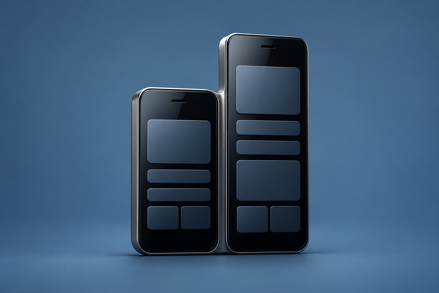
The September 6, 2012 article considered how apps might respond to the next iPhone’s expected display shape. It was published before Apple’s announcement and mixed design observations with predictions.
Apple subsequently introduced iPhone 5 on September 12, confirming a 4-inch display that was taller rather than wider. That later primary source establishes the hardware change; it does not turn every earlier prediction into a confirmed fact.
Extra space needs a purpose
A taller screen can show more of a page, but an app still has to decide what belongs in the additional area. More visible content, a different arrangement and larger decorative elements are distinct choices.
A useful design test is whether the extra room makes the task clearer. For a list, it may help someone compare more items at once. For an interface with fixed controls, the important question may be whether their relationship to the content remains understandable.
Test the layout as an interaction
A screenshot that fills the screen is not the same as a complete adaptation. Check what happens when text grows, content is missing or the device changes orientation. The result should remain readable and the next action should remain clear.
The original post captures a transition in early iPhone layout expectations. This reconstruction preserves that question without repeating speculative specifications or implying that the same implementation approach is appropriate for current devices.